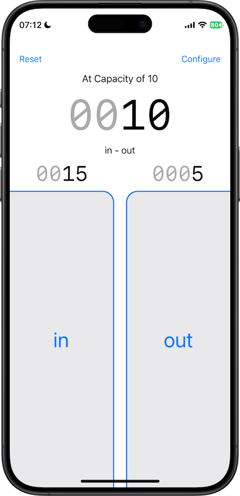
For a tally counter to be truly effective, the buttons that register the count need to be easy to access in an instant, without hinderance. Crowd Control features two large thumb buttons that are designed to be easy to reach on any phone size with hands of any size.
Big buttons like these require custom code.
BigButton.swift
This was written in Swift using UIKit. (You can see the swiftUI version "BigButtonView.swift" lower down the page.)
The code features version checks so that it works as expected on older OS versions. It also contains an @IBDesignable extension so the button can be configured in Xcode's Interface Builder.
//
//  BigButton.swift
//  Crowd Control
//
//  Created by David Kennedy on 10/04/2020.
//  Copyright © 2020 Zenopolis. All rights reserved.
//

import UIKit

class BigButton: UIButton {

    private var currentBorderColor: UIColor {
        let borderColor = self.tintColor!

        guard self.isEnabled else {

            if #available(iOS 13.0, *) {
                return UIColor.quaternaryLabel
            } else {
                // Fallback on earlier versions
                return UIColor(red: 0.23529411764705882, green: 0.23529411764705882, blue: 0.2627450980392157, alpha: 0.18)
            }

        }
        if self.isHighlighted { return borderColor.withAlphaComponent(0.25) }
        return borderColor
    }

    private var currentBackgroundColor: UIColor {

        let backgroundColor: UIColor

        if #available(iOS 13.0, *) {
            backgroundColor = UIColor.secondarySystemFill
        } else {
            // Fallback on earlier versions
            backgroundColor = UIColor(red: 0.47058823529411764, green: 0.47058823529411764, blue: 0.5019607843137255, alpha: 0.16)
        }

        guard self.isEnabled else {

            if #available(iOS 13.0, *) {
                return UIColor.quaternarySystemFill
            } else {
                // Fallback on earlier versions
                return UIColor(red: 0.4549019607843137, green: 0.4549019607843137, blue: 0.5019607843137255, alpha: 0.08)
            }

        }
        if self.isHighlighted { return (backgroundColor.withAlphaComponent(0.25)) }
        return backgroundColor
    }

    override func didMoveToWindow() {
        updateBorder()
    }

    override func tintColorDidChange() {
        super.tintColorDidChange()
        self.updateColor()
    }

    override var isHighlighted: Bool {
        didSet {
            self.updateColor()
        }
    }

    override var isEnabled: Bool {
        didSet {
            self.updateColor()
        }
    }

    private func updateColor() {
        self.layer.borderColor = self.currentBorderColor.cgColor
        self.backgroundColor = self.currentBackgroundColor
    }

    private func updateBorder() {
        self.layer.maskedCorners = self.maskedCorners
        self.layer.borderWidth = self.borderWidth
        self.layer.cornerRadius = self.cornerRadius
        updateColor()
    }

}

@IBDesignable extension BigButton {

    /// The border width around the button.
    @IBInspectable var borderWidth: CGFloat {
        set {
            layer.borderWidth = newValue
        }
        get {
            return layer.borderWidth
        }
    }

    /// The corner radius of the button.
    @IBInspectable var cornerRadius: CGFloat {
        set {
            layer.cornerRadius = newValue
        }
        get {
            return layer.cornerRadius
        }
    }

    @IBInspectable var isTopRightRounded: Bool {
        set {
            if newValue { layer.maskedCorners = [.layerMaxXMinYCorner] } else { layer.maskedCorners = [.layerMinXMinYCorner] }
        }
        get {
            return layer.maskedCorners.contains(.layerMaxXMinYCorner)
        }
    }

    var maskedCorners: CACornerMask {
        isTopRightRounded ? [.layerMaxXMinYCorner] : [.layerMinXMinYCorner]
    }

}
BigButtonView.swift
This is the same Big Button as before, but re-coded in, and for use with, SwiftUI.
This code uses GeometryReader to expand the button to fill the available space and extend to the bottom of the screen.
//
//  BigButtonView.swift
//  Crowd Control
//
//  Created by David Kennedy on 06/07/2025.
//  Copyright © 2025 Zenopolis. All rights reserved.
//

import SwiftUI

struct BigButton: View {

    static var curve: CGFloat = 20

    enum Side {
        case left, right
    }

    var side: Side

    var title: String

    var cornerRadii: RectangleCornerRadii {
        switch side {
        case .left: return RectangleCornerRadii(topTrailing: Self.curve)
        case .right: return RectangleCornerRadii(topLeading: Self.curve)
        }
    }

    var body: some View {
        GeometryReader { proxy in

            let width = proxy.size.width
            let height = proxy.size.height
            let curve: CGFloat = Self.curve

            let accent = Color.blue

            ZStack {
                UnevenRoundedRectangle(cornerRadii: cornerRadii).fill(.quaternary)
                if side == .left {
                    Path { path in

                        path.move(to: CGPoint(x:0, y:0))
                        path.addLine(to: CGPoint(x:width - curve, y:0))
                        path.addQuadCurve(
                            to: CGPoint(x:width, y: curve),
                            control: CGPoint(x:width, y:0)
                        )
                        path.addLine(to: CGPoint(x:width, y:height))
                    }
                    .stroke(accent, lineWidth: 2)
                } else {
                    Path { path in

                        path.move(to: CGPoint(x:width, y:0))
                        path.addLine(to: CGPoint(x:curve, y:0))
                        path.addQuadCurve(
                            to: CGPoint(x:0, y: curve),
                            control: CGPoint(x:0, y:0)
                        )
                        path.addLine(to: CGPoint(x:0, y:height))
                    }
                    .stroke(accent, lineWidth: 2)
                }
                Text(title)
                    .font(.largeTitle)
                    .foregroundColor(accent)
            }
        }
        .ignoresSafeArea(edges: .bottom)
    }
}

#Preview {
    HStack {
        BigButton(side: .left, title: "Left")
        Spacer(minLength: 20)
        BigButton(side: .right, title: "Right")
    }
}